The Joyners #1 Review
Written by R.J. Ryan
Art by David Marquez
Colors by Kelly Fitzpatrick
Letters by Jon Adams
Review by John Dubrawa
 Not all comics are for me and that’s okay. What’s truly amazing about this medium is that it allows for any story to be told, not just the ones focused on capes and cowls. Comics can (and oftentimes do) touch on very real situations that people face in their everyday lives, and focus on characters that are not likeable heroes. That’s just part of the internal monologue I was forced to have with myself after reading R.J. Ryan’s The Joyners #1. After reading this first issue and coming away feeling incredibly cold, I’ve had to accept this is just not the comic for me. Others, however, will surely find the setup and characters compelling and will want to dive deeper into this science fiction drama.
It is without question a wonderfully scripted book by Ryan, who forces the reader to stare unflinchingly into the life of a tech genius who can’t keep his marriage together while trying to develop his next great invention. Ryan has put together an obvious analogy between the main character of his story, George Joyner, and Steve Jobs, who was notorious for being both a visionary and a complete asshole. George appears to be both as well, though with only seeing his genius in only one key scene in this issue, it’s much harder to ignore his abrasive qualities, which are much more prominent. From his secret affair with one of his employees to him flat out being a controlling dick to his wife (“I can stop you. I have the power.”) it’s difficult to really possess any kind of apathy for George as the main character of this series. From the opening “present day” panels (the rest of the issue takes place in the past), we know that a comeuppance is headed George’s way, so at least there’s that. Again though, there are probably plenty of readers that will want to follow George’s self-destruction but I’m not one of them.
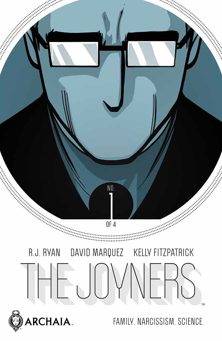
Had I not been made aware of it ahead of time from the front cover of Joyners #1, I may not have ever guessed it is David Marquez’s art gracing the inside of this book. Marquez is an artist I know only from his work on Ultimate Comics Spider-Man, and Joyners is quite a departure from that more realistic style, though that’s certainly not a bad thing. His more cartoonish character designs for Joyners feels like a purposeful misdirect into lulling the readers to feel like this is a story more full of whimsy. This is especially true of Kelly Fitzpatrick’s clean white futuristic color palette as well, though she does implement some muted grays and blues to show that not everything is as idyllic as it seems. One of the big misses, art-wise, in this issue is the lettering, which feels incredibly out of place with Marquez’s art style. The dialogue boxes do not feel like a natural fit and instead become distracting with how out of place they look.
THE VERDICT
Skip It. Confronting such real-life troubles as martial collapse is just not for me, and neither is focusing on a character who is, quite frankly, just an unlikeable guy. But, there are some that will find the inevitable collapse of this Steve Jobs-modeled figure captivating, and thankfully there’s no right or wrong opinion here. For me it’s a hard pass but others may want to at least give the first issue a shot and see if the drama captivates you.