 You’re down on your luck. Rent is past due. Suddenly, you get a letter saying you’ve received a mysterious inheritance from a dead relative that’s worth a fortune. How bad can it be? If the first issue of Stillwater is any indication, it can be … pretty bad.
Daniel is a designer who doesn’t love his job, but jobs pay the bills. Except when you get fired for punching a co-worker. Out of a job, Daniel wonders how he can afford to live a young, single guy’s lifestyle when suddenly a mysterious letter arrives telling him of an undisclosed sum from a recently-deceased great-grand aunt. With nothing to lose, Daniel and his friend venture to the mysterious town of Stillwater. Who is this dead aunt, and how much did she leave? As events escalate, those questions get replaced by a whole, whole lot more.
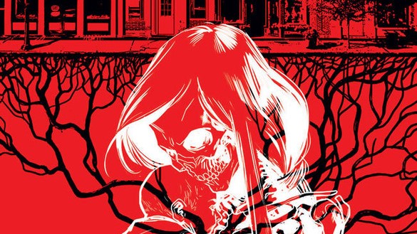
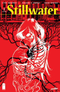
Stillwater creators Chip Zdarsky and Ramón K. Pérez weave a horror tale that, weirdly enough, doesn’t feel a lot like horror at first blush. Flip through the pages of the book and take in the artwork alone, and you’re left with a fairly unremarkable impression. The eerie cover says horror, but there’s no monsters. No ghosts. Nothing entirely gruesome save for an accident (that definitely is not an accident). The comicbook feels almost too much like real life, and that’s where the strength of the story arguably lies.
We quickly learn that the town is not everything it appears to be (no one can die…it’s in the solicit, spoiler avoiders!). What starts out feeling Elizabethtown quickly gets a little Wicker Man. Just when you think you’re starting to figure everything out, the very last page adds an extra dimension. Zdarsky does a tremendous job presenting us with a loveable asshole in Daniel and makes us feel a part of the roadtrip into madness.
Pérez’s artwork builds on top of the foundation of the story in that it doesn’t really feel like a horror book, but it definitely is. It has almost a Silver Age, old-school quality to it that is aided by the soft colors of Mike Spicer. And while it goes the old school route, the coloring also adds a modern edge with the brighter colors that allow different scenes to pop.
Stillwater #1 is a gripping, mysterious start to what should be a fantastic series for horror fans. If that isn’t enough to convince you to buy it, here’s another thought: I don’t know what you want. If you are looking for ransom, I can tell you I don’t have money, but what I do have are a very particular set of skills. Skills that make me a nightmare for people like you. If you buy Stillwater now that’ll be the end of it. (Buy the book; you’ll get the joke when you do.)


