 Writer: Aleš Kot
Artist: Luca Casalanguida
Colorists: Heather Marie Lawrence Moore
Letterer: Aditya Bidikar
Cover Artists: Luca Casalanguida, Heather Marie Lawrence Moore
Designer: Tom Muller
Production Artist: Ryan Brewer
Publisher: Image Comics
In a world as complicated as ours, do the ends justify the means? Does the world need men willing to compromise their morality for the common good? What effect could this have on someone’s psyche? These questions and more are considered in Lost Soldiers #1 by writer Aleš Kot and artists Luca Casalanguida and Heather Moore as they seek to examine the consequences of actions. And what better way to exemplify this than through the lens of war and violence.
Set during the Vietnam War in 1969 and 40 years later in Juarez, Mexico, Lost Soldiers follows three men deeply affected by their time in the war. Those familiar with Kot’s work will know that he’s more interested in political and social commentary than any sort of bombastic “oorah” action you might find in other war stories. From the first page, Kot establishes the tone by juxtaposing the loudness of violence and the lasting emptiness of death. It’s a well done sequence that informs the rest of the story, particularly the dialogue. The camaraderie between characters can be felt through their words, but there’s a looming sense of dread reinforced by the narration boxes continued from the first sequence.
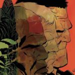
Casalanguida’s jagged and rough art style does a great job of portraying the chaotic and suffocating jungle environment many soldiers fought and died in. However, it’s the character work that really stands out. Not only are the three main characters easily discernible but also their emotions are as well. Whether it’s adrenaline, shock, anger, or coldness, the weight of the war clearly shows on their drained and tired faces 40 years later. Moore’s colors also play an important role with characters literally seeing red even after the fighting has ended. It’s an interesting motif that seems to indicate themes of PTSD and the violence men surround themselves with. The letters by Bidikar are clear and easy to read but really get a chance to shine during an adrenaline-fueled, messy shootout.
Lost Soldiers #1 brings with it a confident creative team who are all on the same page. The story drags a bit in the middle with some heavy dialogue and jargon-filled panels, but the art remains on-point and consistent with the commentary Kot wants to convey. With an impressive first issue and only four more to go, readers won’t want to miss out on this mini-series


