Bonehead #1
Writer: Bryan Hill
Artist: Rhoald Marcellius
Colorist: Sakti Yuwono
Letterer: Imam Eko & Jaka Ady
Publisher: Image Comics
Review by Evan Maroun
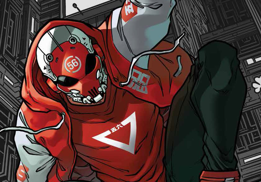
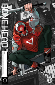
 When looking at the cover for Bonehead, it was hard to not make comparisons to a certain web-slinger. The cover portrays the nameless protagonist sporting the same color and quite a familiar pose. However, once I dove into the book, I noticed more similarities. The protagonist seems very comfortable flying over the city using enhanced aerobatics. This is in thanks to cybernetically enhanced parkour skills rather than being bitten by a radioactive arachnid. But you get the idea.
As I mentioned, our cyberpunk hero is nameless, and it stays that way throughout the whole debut issue. In fact, he only says one word throughout the whole thing. Now, I can get behind a silent protagonist if executed well, but my main issue with Bonehead is a pretty glaring one. It’s that you don’t learn anything about the main character himself, outside of the fact he works for a gang of cyber rebels and has some kind of secret. With no dialogue and very little personality, it’s hard to latch onto a character you know next to nothing about. Part of this problem could stem from the short time-frame in which this issue covers. Without getting into spoilers, there is one major setpiece that lasts about half of the book. It’s then followed by two more small story beats, and boom, it’s over. That is why I didn’t jump right into a summary of the story, as it’s hard to even talk about what is going on (without just relaying the short number of events) just yet.
If Hill had spent a little more time on the introduction of some of the characters here and made them feel like actual residents rather than robots, I think it would’ve made this opening issue far more gripping.
When it comes to world-building, not all is lost. We get a slight understanding of the organization that acts as a police force. Titled the Gladiators, We don’t yet understand why the Boneheads do what they do. However, we do get to understand a small extent of the Gladiators authoritative power. Thanks to the art by Marcellus and the colors by Yuwono, we do get a crisp view of this tech-fueled metropolis. With the city an illuminated blue/green hue, the bold character designs really pop off the page. Action panels are more highlighted here (being the majority of the issue) with some of the sound effects jumping out with all the electrifying liveliness of the 80’s.

Verdict:
Wait and See.
As it stands now, Bonehead falls into the unfortunate pitfall of style over substance. Luckily, Hill does hint at a reveal on the horizon, and the artwork is fun enough to warrant checking back in next issue. With what seems to be a solid premise at its core, I hope Hill has plans to make it all feel lived in–inhabited by characters we can root for.

![[PODCAST] FBPH PRESENTS: SET FACES TO STUNNED EPISODE 11 — FURTHER DISCOVERIES!](https://geekd-out.com/wp-content/uploads/2019/05/Faces-150x150.jpg)


One thought on “Bonehead #1 Review”