
Creator: Colin Work
Cover Artists: Colin Work, Donovan Yaciuk, Loc Nguyen
Publisher: Primal Studios
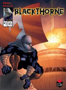 Blackthorne is Calgary’s very own vigilante. After 10 years in retirement, Blackthorne has returned to fight the sprawling city’s criminal world. Blackthorne #2 sees the hero training and recalling the events that led to his retirement in the first place.
The world that Colin Work has created is more of an epic saga than your regular superhero origin story. By dropping us into his late history, Work drives up the intrigue about who he is, why he retired, and why he came back. He mentions things that make you curious about his past and leaves you wondering what other heroes have called Calgary home. There seems to be a legacy to Blackthorne and that this version of him is not the first incarnation. This Blackthorne is like Damian Wayne Batman plus Daredevil plus the Punisher: a brutal and incredibly skilled fighter, raised in a local gym, and trained by his family. Some of Work’s dialogue feels forced and unnatural, but it serves the purpose of establishing an emotional connection between the reader and the Blackthorne family.
I want to like the art in Blackthorne #2. The story is compelling and makes me want to read more, but the art! I find Work’s anatomy to be … rough; particularly with regards to the female physique, which seems too small to even exist. Blackthorne should not be able to wrap his hand around her waist like I wrap my hand around my wrist. Hands and feet are abnormally huge, and many of his features like noses and mouths seem to be the exact same for each character. His panel layouts are easy to follow but are sometimes too “close up” on the subject. Pulling out a bit would make the subject more clear and more pleasing to the eye. Some of Work’s backgrounds just lack detail or perspective. Overall, I just feel like the art is rushed and could use some more work before going to print.
Lettering is one of the most unsung points of comics. Unfortunately, most people don’t notice it when it’s done well, but they definitely notice when it’s done poorly. Work does a pretty good job on his lettering for the most part. Words fit nicely in their balloons but are at times too close to the walls of the bubble or inconsistently sized. Words should be one size if they are speaking in a normal tone of voice, bold to show emphasis, and changed in size only when they whisper or yell.
Blackthorne #2 has the potential to be a great hero for the City of Calgary and a great comic book series. The world-building Work has done is phenomenal, but it’s hard to look at.
Although no official date has been set yet, Blackthorne #2 will (eventually) be available through Colin Work’s Facebook page.
Blackthorne #2


![[REVIEW] THE QUEEN OF THE GALAXY RETURNS IN ‘BARBARELLA #1’](https://geekd-out.com/wp-content/uploads/2021/07/4BA24C2C-0341-4E4A-9E70-ECE991C3BCC9-150x150.jpeg)

![[REVIEW] DARK RIDE #1](https://geekd-out.com/wp-content/uploads/2022/10/2A677263-247E-46D8-A9CD-F26D5D9B136F-150x150.webp)