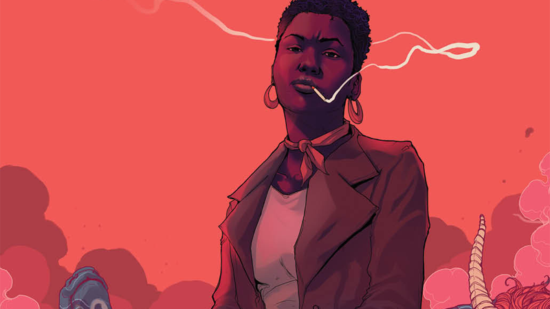
Abbott #1
Writer: Saladin Ahmed
Illustrator: Sami Kivela
Colorist: Jason Wordie
Letterer: Jim Campbell
Publisher: Boom! Studios
A review by Greg Brothers
 As someone who deals with history and politics daily I am generally a fan of periods pieces. It is even better when those books are in the hands of a writer as skilled as Saladin Ahmed. For good reason Ahmed has gotten allot of praise for his work on Black Bolt. Which is hard for me to say because generally I am not a fan of The Inhumans. So, when I heard about Ahmed writing Abbott I knew I would be checking it out.
Abbott #1 introduces us to Elena Abbott. She is a take no prisoners, hard-nosed, African-American reporter in Detroit in the 1970s. As the story starts she has just put out an expose on the police brutality in Detroit, most of which has been pointed in the direction of the African-American community. Already dealing with the backlash of the story, Abbott now is trying to investigate the brutal murder and mutilation of a police horse and another unidentified man. As she starts to investigate the story it becomes obvious that these attacks are not your every day run of the mill attacks. Instead they have connections with something that Abbott has experienced before.
Ahmed takes a majority of the first issue to lay the foundation of the story moving forward. Abbott is established as a strong character who also has her own tenderness that she must hide from the prying eyes of the public. Ahmed separates the two sides of Abbott perfectly. The supporting characters provide the perfect amount of both support and foil to the fearless reporter. It is obvious from the beginning who Abbotts allies and enemies will be. Racial tensions are present throughout the book, and Ahmed does an excellent job of using them as another character in man ways. They provide motivations, conflict, and ideology for several of the characters throughout Abbott #1.
The art in Abbott #1 uses the period perfectly. The book has a noir type feel with art that is gritty and muted. Each panel is filled with detail upon detail. With character designs that fit perfectly with what one would expect in the 1970s. One small such detail revolves around Abbott herself. When around those she does not know or trust she always carries a stoic look, and then while around those that she trusts she lets out the slightest smile. While the panels are stacked in a traditional manner with plain white gutters. The details are in the small inserts that are found throughout those larger panels. Campbell’s lettering does an excellent job of establishing the different moods of the book as it bounces from dialogue to traditional typeface.
Verdict:
Buy! Ahmed is able to establish a story that draws you in from page one. Abbott #1 introduces characters that you immediately want to know more about. While Abbott herself first gives off a hardened and stoic personality, it becomes obvious that she must give off such an aura to be successful in her profession. The art moves you eyes to the important parts of the panels. And the details of those panels take you back to a different time. By the end of Abbott #1 you are left wanting more and a much bigger mystery than you ever expected on page one.

![[REVIEW] RECKONING WAR: TRIAL OF THE WATCHER #1](https://geekd-out.com/wp-content/uploads/2022/03/reckoning-war-watcher-1-feat-150x150.jpg)


2 thoughts on “Abbott #1 Review”