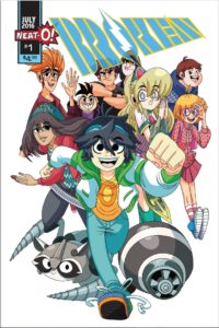
Broken #1
Writer: Johnny Parker II
Artist: Jose Garcia
Colorist: Paola Rodriguez (pages 1-7), Prajak Janpate (pages 8-28)
Letterer: HCMP
Publisher: Neat-O Comics
A review by Andrew Dmytrasz
 When fights are no longer physical, they become cyber scrap battles in which people use Scrappers in virtual combat. When a young boy named Patrick loses one of his favourite Scrappers in an unfortunate sauce incident, he acquires a new Scrapper that has been discarded because her previous owners thought she was useless and could never win. Is there more to meets the eye with this Scrapper? Is she broken or will Patrick unlock her potential?
It’s tough to describe the sort of feelings Broken #1 evokes. It feels nostalgic, collecting old parts to build something new is a childhood pastime, but Parker puts a new twist on it that makes the idea feel new. No Scrapper is better than any other in the world of Broken, each are perfectly balanced and the outcome relies solely on the skill of the players. None of them come pre-programmed with any moves and it is up to the individual player to teach their Scrapper how to fight. This allows the players to figure out their Scrapper’s strengths and weakness and how to best use them in combat. While some people may be better with some scrappers, each scrapper has the possibility to win if utilized properly.
While it may seem all light and fun, Broken #1 touches upon some solemn issues of bullying, dealing with family health issues, sticking with your word and following through on things. Grounding the comic in such heavy themes makes Broken #1 feel like it has some weight and value in what could have been a throwaway romp, and Parker does a nice job shifting from fun to serious without changing the entire feeling of the comic. For example, when he boots up his new Scrapper Erin, it’s a mix of excitement testing out the new fighter but also sticking to his word and dealing with the situation of a Scrapper feeling neglected and unwanted.
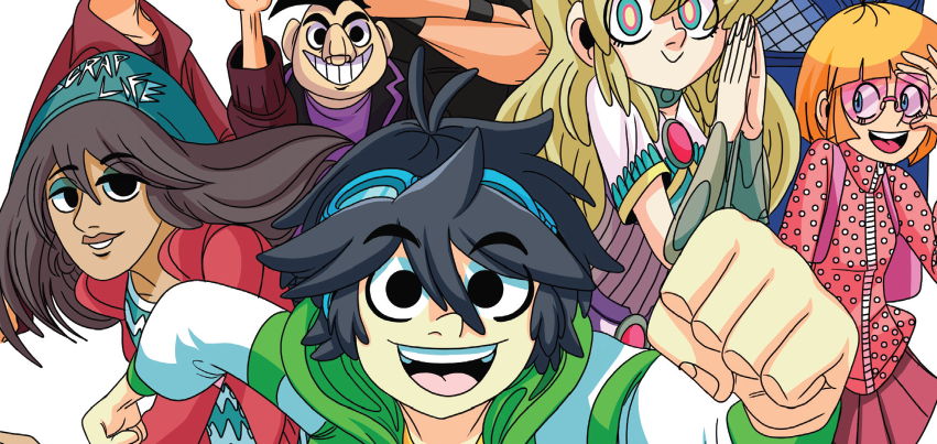
I love the art in this comic. Garcia, Rodriguez, and Janpate give Broken #1 the look of manga mixed with a 90’s cartoon. The colours work to emphasize the fun but heavy tone of the comic, using bright colours for the action to keep the reader engaged as well as more subtle colours which brings back those familiar feelings to it. The panel layout is also quite interesting, Garcia, Rodriguez, and Janpate use a combination of sealed panels, full page layouts but also having the characters overlap different panels breaking the normal convention style of comics.
The Verdict
Read It! Coming in at 32 pages, a third of the issue is completely devoted to explaining the cyber scrap battles. Although issues like this often happen with new stories, it’s hard to get a feel for where the story is headed going forward. Broken #1 has a lot of potential. The possibilities are thrilling and the artwork is fantastic. Broken #1 gives off a solid tone in its first issue and is only a few pages long, so although the characters haven’t had any time to develop or grow, I am looking forward to seeing how they will change.

![[REVIEW] CAPTAIN MARVEL #1](https://geekd-out.com/wp-content/uploads/2023/10/cm1-feat-150x150.jpg)

