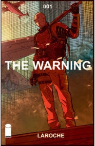
The Warning #1
Writer, Artist: Edward Laroche
Colorist: Brad Simpson
Letterer: Jaymes Reed
Publisher: Image
Review by Michael Farris, Jr.
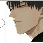
 The Warning #1 starts out with a serene scene: a single soldier out in a field watching a bee work as he contemplates life, death, and reincarnation. Fitting, since the whole world seems to be on a collision course toward extinction, and the soldier’s unit Gladiator Two-Six is there to stop it. Through a series of flashbacks, we learn that a mass in space broke off from a rogue planet and is headed toward Earth. What? We don’t know…yet.
If you pick this book up, you’ll noticed it’s a little thicker than the standard 22-page issue. Reading through it, though, is a lot faster than a lot of those standard-size comics. The book uses full pages to either give us the setting, give us a letter-boxed panel to emphasize that particular panel, or set the tone of what is sure to be an epic-sized story. The writing flows quite easily, too. There are times when you encounter military or science-y jargon, but it comes across more as background and somewhat comprehensible, so you feel kind of smart about yourself for reading it and not getting confused.
The book itself largely feels like a setup. Think of some of your favorite invasion or disaster movies—Independence Day, Arrival, Armageddon, etc.—it’s similar to the first five or so minutes of one of those movies that makes you aware of this situation in which humanity is about to find itself. But—spoiler alert—we don’t know exactly what by the end of the book. If this was Issue #0 instead of Issue #1, that would have made sense, but it really does set the right kind of mood with that simple scene in the beginning before we get the idea that all hell is going to break loose. The method of how the narrative was laid out where the present is ambiguous and the past slowly lays out the stakes was also enjoyable and leaves you wanting more by the end of the book.
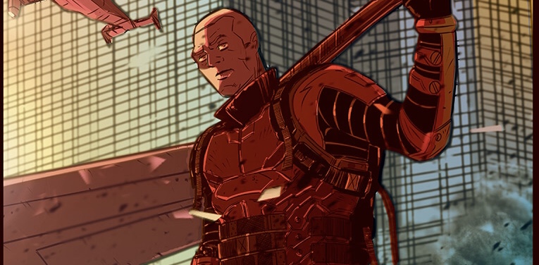
The artwork was captivating in a lot of ways. The characters were drawn in a gritty but comic-booky style (that for some reason reminded me of the cutscenes in the Grand Theft Auto: Chinatown Wars game). There are certain times the backgrounds are blurred out to give the ready\er a kind of depth-perception focus that makes it feel like you’re watching that scene in Harry Potter where Hermione is reading the Deathly Hallows story.
Verdict: Buy it.
While it largely felt like a setup, you get the impression that Laroche knows his story and his characters well enough to slowly trickle out everything that is to come. The Warning feels akin to Arrival or Independence Day in the best way possible.

![[PODCAST] THE COMICS AGENDA: NAILBITERS AND VAMPIRE SLAYERS](https://geekd-out.com/wp-content/uploads/2017/11/comics-agenda-2-150x150.jpg)