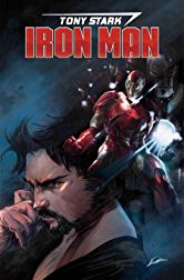
Tony Stark: Iron Man #1
Writer: Dan Slott
Artist: Valerio Schiti
Color Artist: Edgar Delgado
Letterer: VC’s Joe Caramagna
Publisher: Marvel Comics
Review by Greg Brothers
Recently Marvel announced the fresh start initiative. With it the plan is that most of the comics would undergo some  creative team changes, starting new arcs and directions. Some of those have been extremely successful recently. Then others like Tony Stark: Iron Man #1 just feel like the restart to a rehashed story that we have all read before.
We have Tony Stark going to find one of his old rivals that he had as a youth. Instead of convincing the former rival to join the team, he buys the man’s company–basically forcing the man to work for him. Of course, Tony has to show off several times as he battles a larger-than-life enemy attacking the city. As the first issue wraps up, we see once again that Tony’s overconfidence may lead to his downfall.
One of my biggest concerns in Slotts’ run on Amazing Spider-Man was the voice that Peter Parker was given. I thought after turning Peter into Tony Stark for the better part of the last four years that Slott would be able to write an overconfident billionaire who is trying to do the right thing. Unfortunately, all the work that has been done by the previous creative teams is tossed out the window and the totally-over-the-top-jerk Tony Stark is back. Besides my issues with Slotts’ characterization of Stark is the fact that nothing new really comes out of Tony Stark: Iron Man #1. All we get is more of the same: specialized suits, forcing people to work for him, and really bad jokes. Been there done that. Even the reveal at the end of the issue was foreshadowed within the first few pages.
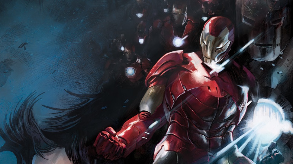
The art does nothing to help the weak dialogue and storyline. The line work throughout is muddled, not very focused. In several panels it is hard to tell if Tony has a moustache or had really bad lip filler. So many panels are missing details and basic structure. If this was somewhere in the middle of the run, it may have been excusable, but for a first issue the art should be on point. On top of that, the colors throughout feel muted and bland.
Verdict: Skip It!
Tony Stark: Iron Man #1 squanders the chance to bring in new readers and instead presents a bland and unoriginal “Fresh Start.” The art is muddled and leaves you wishing for more details and style. If you want a book featuring Iron Man pick up Jason Aaron’s Avengers, which is a much more compelling story.


