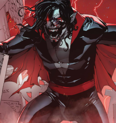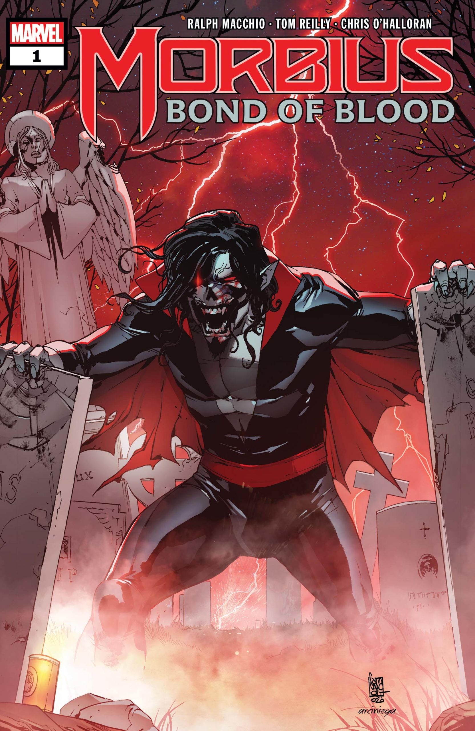
 The Living Vampire of the Marvel Universe is back for another frightful tale in this week’s Morbius: Bond of Blood #1 one-shot, and the question is such: Should you take a bite?
Morbius: Bond of Blood #1 was undoubtedly meant to coincide with the release of Jared Leto’s upcoming film, originally dated for July 2020, then March 2021, then October 2021, and now January 2022. With this one-shot completed and ready for publication, though, Marvel probably figured there was no point in waiting for the movie to release it. In any event, Morbius: Bond of Blood is a surprisingly decent story with a solid creative team that will likely satisfy fans of the Living Vampire until they finally get to see him on the big screen … whenever that ends up being (I am so tired of living through an endless pandemic…).
The story here is fairly simple: Michael Morbius tries to save the life of his sickly nephew, whose father he accidentally killed in the accident that gave him vampiric powers all those years ago. To the credit of writer Ralph Macchio (not that one), the brevity of Bond of Blood is a benefit, not a hindrance. Macchio has done a number of self-contained, continuity-light one-shots over the past few years (usually coinciding with major movie releases) that are very accessible to potential readers while also giving existing fans of the characters involved something new to read. While Bond of Blood probably wouldn’t work as a limited series, the economical storytelling on display here is impressive, wrapping up everything it needs to do (while also providing a condensed origin story for the less-initiated) within 20-odd pages. In the age of decompression and writing for trades, I have to praise this approach. Sometimes you wanna just read a one-and-done superhero story, y’know?
But I have to say the real star of this one-shot is Tom Reilly’s art. Reilly, most recently of Jay Edidin’s Cyclops-centric X-Men: Marvels Snapshots #1, has a wonderful retro sensibility in the vein of Chris Samnee, Greg Smallwood, and Leonardo Romero that serves and elevates the material well. The truncated method of his visual storytelling, usually employing multiple smaller panels on the page rather than opting for larger splashes or widescreen panels, allows for lots of room to focus on specific moments while also keeping the momentum going. Chris O’Halloran’s colors are also a great asset here, whose bright colors provide some contrast to what would otherwise be a dark and gloomy horror piece. After observing their quality work here, I’d very much like to see the two collaborate on another project.


![[REVIEW] A WICKED AWESOME CHARACTER RETURS IN ‘THE MANDALORIAN CHAPTER 15: THE BELIEVER’](https://geekd-out.com/wp-content/uploads/2020/12/Mayfeld-150x150.png)
