Redlands #1 Review
Writer:
Jordie Bellaire
Artist:
Vanesa R. del Rey
Colorist: Jordie Bellaire
Letterer: Clayton Cowles
Publisher: Image Comics
 A review by Nico Sprezzatura
Two clashing, evergreen ideas —matriarchal witchcraft and the patriarchy— collide in this week’s Redlands #1 from Image Comics. The issue couldn’t have come at a better time.
Without saying too much about its story, Redlands posits a male-driven community in the seventies that’s upended by the arrival of a coven. The witches look to salvage what’s been ruined by men. Given our current political climate filled with destructive, women-fearing men, Redlands #1 will probably make you wish for a similar regime change.
Redlands #1 is superstar colorist Jordie Bellaire’s debut as a writer on an ongoing comic series, and her experience in the industry absolutely comes through in its tense, tight scripting.
Number ones are tricky. Do you throw the audience into the middle of things straight away, or do you tease the plot out as a slow burn? As an introductory issue, Redlands #1 is largely set up for what’s to come next, but there’s enough going on to make it a captivating reading experience and hook readers from the jump.
Bellaire’s approach seems to resemble a slow burn, trickling out details of Redlands’ story page by page; we don’t meet our main characters until the last few pages of the issue. But when all’s said and done, its components start to fall in place. We then have an idea of what to expect moving forward.
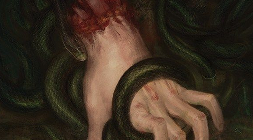
Perhaps because of her background in art, Bellaire wisely keeps each panel sparse with minimal dialogue. This approach leaves ample room for illustrator Vanesa R. del Rey’s visual storytelling. I’m familiar with del Rey’s prior work, but in Redlands, she massively upped her game.
There’s a rough, sketchy quality to del Rey’s linework that suggests an eeriness you’d expect from a story about witches. She fittingly lent this style to the first issue of Marvel’s recent Scarlet Witch series. Del Rey is the go-to artist for stories about witchcraft, apparently.
Though her debut as a writer is impressive, Redlands also has Bellaire pulling double duty as —you guessed it— the colorist. Simply put, Bellaire is one of the best in the business. I’ve encountered her coloring work several times. When you tell someone she colored a book, there’s a good chance you can get them to try a concept they’d otherwise overlook.
In Redlands #1, Bellaire’s colors are good as ever, surrounding warm tones and sickly greens with deep blacks throughout the issue. You can tell there’s a great synchronicity between Bellaire and del Rey in their collaborative effort. The same might not have been achieved if Redlands was written by someone who lacked Bellaire’s experience in art.
Rounding out the creative team is lettering impresario Clayton Cowles, who delivers his reliably top-notch work here. Though Bellaire’s script is loose and not overly dense, Cowles renders each dialogue bubble with fluid clarity. Cowles also integrates sound effects organically with del Rey’s illustrations. One notable example: there’s a slanted, three-dimensional SLAM laid across a surface as someone is knocked backwards, and you can feel the sound as it’s written on the page. Just good stuff all around in the lettering game.
The Verdict
Boasting a strong creative team (and an impressive writing debut from colorist Jordie Bellaire), Redlands #1 is pure witch fulfillment for our rapidly regressive world.


![[REVIEW] TAKE THE TIME TO DIVE INTO ‘BEYOND BLUE’](https://geekd-out.com/wp-content/uploads/2020/07/beyond-blue-wallpaper-150x150.jpg)
![[REVIEW] NO ONE LEFT TO FIGHT #2](https://geekd-out.com/wp-content/uploads/2019/08/NOLTF_2-2-150x150.jpg)