Morphite
Publisher: Crescent Moon Games
Developer: We’re Five Games
Platform: Nintendo Switch
Review by Bryce William
Exploring distant planets, refuelling your spaceship, scanning life forms, and boss battles may sound great on paper, but the overall execution in Morphite left me wishing the developers spent more time in crafting this game.
The story of Morphite is pretty light. You play as Myrah Kale, a young woman who lives on a space station. You assist your surrogate father character, Mr. Mason, in simple missions, that leads to the story unfolding. The story isn’t deep, and at no point will you be awed at what unfolds. There are some genuinely funny moments between Myrah and her cat robot companion Kit-Kat. The voice acting was good, but the background music often drowned out what was being said. As the dialogue happens in real-time, there was no way to go back to listen to what was said again.
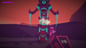
The first thing you will notice in the game is the simplistic, yet stylish graphics. The neon coloured, low-poly look made me feel like I was playing a PC game from the 90s. Today’s 60 frames per second shooters can cause eye fatigue, but the simplistic graphics made Morphite calming to play. With this design choice, you can run into problem if not properly executed. There were many times where I was unsure if an environmental item could be interacted with, such as a switch, or a crate to shoot. I wish the developers had added something to interactive items that made them stand out, such as having them rotate, or adding some highlight around it.
Due to a combination of the art style and level design, the simplistic visuals lead me to missing obvious paths due to it all looking the same. Near the end of the game I felt as if I had stepped into the Windows 95 screen-saver maze.
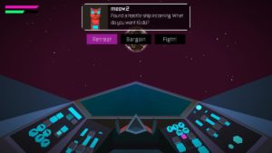
The draw-distance is slightly above Turok on the N64, if that reference doesn’t resonate with you, at best you can only see slight distances ahead of you. For a game that is supposed to be about exploration, this really impacted my enjoyment of it.
The game also could have benefited from visual cues to lead the player to their next objective. There were several of the mission based worlds where it was not clear where to head to next, and I found myself going in circles.
The UI can be frustrating. Early in the game you have few weapons and items to choose from, which you can cycle through using the d-pad, but later into the game with 11 items, the only good way to chose the right one was to enter a sub-menu. In areas where I had to switch between multiple items, I found it very cumbersome. Pressing up on the d-pad opens up your Map menu, but the only way to get out of map view is to press B. This in itself is fine, but it never prompts you to press B, I had to try ever button in order to figure that out. Aiming and shooting at enemies can be difficult, but there is an aim assist button that will target them better. This aim assist was never taught to the player, I had to figure that out on my own. Finally, the games menu screen takes just an extra half-second longer than you would want, which made it felt clunky.

The map, which is always on your HUD seemed to only be useful a handful of times in the game, which makes me wonder if it was even needed at all.
I fell through the world of Morphite more than once, and even encountered a few moments where I sequence breaked, which lead to me being trapped, and having to start over. With checkpoints sometimes far between, this meant having to fight an enemy again, or complete difficult platform jumps. Many times I would hop on an elevator or platform, that wouldn’t activate until I was in a ‘sweet-spot’. I encountered many invisible walls, and ended up in areas I shouldn’t have.
Hoping planet to planet became more tedious than enjoyable. Your next objective course is plotted out for you on the star map. Early in the game it was nice to stop in at planets to explore, and farm some minerals, but later in the game I found myself slowly and awkwardly getting from point A to point B, in a tiresome, instead of enjoyable set of actions.
Verdict:
I didn’t enjoy. I felt like it was trying to be too many games at once, and never perfected any of them. Some tweaks and adjustments would have increased the gameplay enjoyment, but as it stands, I would pass on the game.


![[REVIEW] BUFFY THE VAMPIRE SLAYER #5](https://geekd-out.com/wp-content/uploads/2019/06/AE622DFE-1E00-422D-A1D0-F3FF245D124E-150x150.jpeg)
