The Chilling Adventures of Sabrina the Teenage Witch #5 Review
Writer: Roberto Aguirre-Sacasa
Artist: Robert Hack
Review by Stephen Combs
 When most people think of Sabrina the Teenage Witch the first thought that comes to mind is the TV show starring Melissa Joan-Hart from the late 1990s. Perhaps they may think of the sugary Archie Comics that have been published off and on since 1971. The last thing that people think of is the infamous EC horror comics from the 1950s that adults felt were so offensive that they eventually lead to Congressional hearings about whether or not comic books caused juvenile delinquency (which then lead to the Comics Code Authority which banned, among other things, werewolfism). Surprisingly The Chilling Adventures of Sabrina the Teenage Witch, which is set in the 1960s, has more in common with the EC comics than any of Sabrina’s previous incarnations.
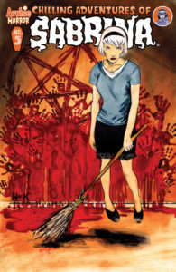
Robert Hack’s artwork immediately sets the tone for the entire comic. It is dark, it is sketchy, and it feels menacing. Anyone who has seen any of the EC comics from the 1950s would clearly see similarities between the art styles. It is clearly intentional. The art is key for appreciating the setting in the 1960s. The clothing and hair choices in particular make sure the reader never forgets what decade the comic book is set in. Furthermore, one of the most difficult things to do in comic books is to make characters look different, and each of the characters that Hack draws is clearly recognizable. Without reading a line of dialogue there is no doubt which character is which. The design of the main villain, Lady Satan, in all her forms is simply brilliant. Skull face that can look normal, along with a Roguesque white stripe in her black hair. It is beautiful and menacing.
The writing is good, but not exceptional. Sabrina wants to resurrect her boyfriend who was killed in the last issue, but first has to deal with a trial at the witch’s council. The trial is a fun little scene to see how Sabrina gets out of it, but the use of Alistair Crowley, whose first name is never used, is annoying and unimaginative. The entire scene is short, but still goes on too long. The use of characters from Riverdale that I will not name also shows the same laziness and lack of imagination that is shown in Crowley. That said, all of the characters clearly have their own voices. Their motivations make sense, and the end of the issue is legitimately chilling.
The Verdict:
Buy It! I am not a fan of horror movies, comics, or any sort of horror fiction and I enjoyed the issue. The artwork is some of the most amazing and unique that you will see in a comic book this year. The problems I had with the writing may very well be issues that I take more offense at than others, and the good does outweigh the bad. Finally the way the issue ended just has the reader begging to read the next issue.


