
X-Men Gold #13
Writer: Marc Guggenheim
Artist: Mike Mayhew
Colorist: Rain Beredo
Letterer: Cory Petit
Publisher: Marvel Comics
A Review by Greg Brothers
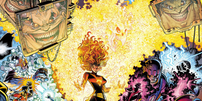
The X-Men have an extensive list of enemies and villains that they cross paths with on a regular basis. One of the more ridiculous ones is Mojo: a spineless alien creature from a universe where entertainment ratings are what rules. So, naturally the X-men are a popular subject, and in X-Men Gold #13 Mojo begins a 4-issue crossover with X-Men Blue.
X-Men Gold #13 starts with Mojo lamenting a continuous decline in ratings. Mojo is reviewing a script that he feels is sure to reverse the decline. Jump to several X-Men playing in a game of softball with a time-displaced team. However, of course, no softball game is going to go as planned. Just as quickly as they have started the game, mysterious items begin to plummet towards Earth. Suddenly, and unbeknownst to the X-Men, they become part of Mojo’s rating wars.
Even if you do not know who Mojo is, Guggenheim does an excellent job introducing him without risking insult to long time readers. You know within the first pages what motivates Mojo and have an idea of how he plans to fix it. Guggenheim has been writing X-Men Gold for about 6 months. In that time, he has shown he knows how to write the team dynamic and that continues here. Adding in the time-displaced team for this crossover arc allows for Guggenheim to play with those relationships even more and use the environment to really explore some of the characters. For example, we witness Old Man Logan meeting his son James, and there is obvious tension between Kitty and the young Jean Grey.
Since the situation in issue 1 with the artist hiding stuff in the series, X-Men Gold has had various artists. Some of the artists have been great and some not so much. Unfortunately, X-Men Gold #13 has some major flaws in the way that they are drawn. I do not know if at some point Colossus stole Mayhew’s girlfriend, but Mayhew seems to have something against him. In his human skin version, Colossus is drawn with super short legs and long arms–making him look monkey-like. Meanwhile, his metal version is drawn as globs. Just imagine Terminator 2, if you want a reference. And that isn’t even the wors parts of it. In his metal form, his face looks like Joel Pesche. It’s bad…really bad. The colors on the other hand are bright and clean and welcoming. The Mojoverse panels pop with their bright pinks and purples. It is everything you can hope for, and the coloring combined with the story make this comic an enjoyable read–despite the art.
Verdict: Buy it!
X-Men Gold #13 is a delightful story that provides a great start for the crossover. It is a shame that Mayhew’s art is so bad. I would suggest reading the panel and then closing your eyes and imagining someone else drew this issue. Regardless, moving forward I have the ultimate trust in Guggenheim’s writing. Let’s just hope that we can get a competent artist soon!


One thought on “X-Men Gold #13 Review”