VS #1 Review
Writer: Ivan Brandon
Artist: Esad Ribic
Colorist: Nic Klein
Letterer: Aditya Bidikar
GFX & Design: Tom Muller
Editer: Sebastian Girner
Publisher: Image Comics
Review by Cory Webber
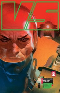
 VS #1 imagines a future where warfare has become a spectator sport. Privately funded armies of superstar soldiers march into battle for fame, profit and the glory of their sponsor nations. When a new generation of soldiers arrive, top gladiator Satta Flynn is about to discover how fleeting the limelight can be.
VS #1 opens up in the middle of a battle on a futuristic earth-like planet. We are introduced to Flynn and his team as they coordinate their attack. Their team makes some good ground on their opponent, but then they are given a penalty. And that is where we are introduced to the spectator aspect of this battle being broadcasted. There are sponsored messages, programming reminders for upcoming shows, censored curse words, and play-by-pay commentary.
Brandon really gives depth to Flynn and, in a short time, gives us a solid look at what his life is like now that he’s in the twilight of his career. He writes battle scenes really well. The action was intense, and extremely well-paced. However, as a first issue, I feel like it lacks a little in the world-building outside of the main character. I’m hoping this will be explored more in the next few issues.
Now, I’ll be honest, I first opted to read VS #1 because Esad Ribic is on art duties. I loved his work on Marvel’s Secret Wars and Thor: God of Thunder. Now, the rest of the talent involved did a fine job at making sure I didn’t just stare at his pencils. I was instantly drawn in by the first four pages — they were classic Ribic. The first page is an outer space shot with a planet in the background and the faint depiction of an asteroid-hybrid space ship approaching the planet. The next few pages follow this ship as it gets closer to the planet where the battle is taking place. I was constantly thinking about how I really want to see a film with Ribic as the Director of Photography, based simply on the scope and point-of-view he employed. His shots are simply breathtaking, and really guide your eyes in unexpected directions. His inks add so many layers of depth that it almost seemed like I was viewing the book in 3D.
Klein’s colors give Ribic’s art an otherworldly feel. He uses a lot of blues and greens with some orange and red pops and splashes, to great effect. I can’t continue without mentioning the lettering. Bidikar did a great job. No word bubble seemed too full. On panels that contained a lot of words, he broke up the bubbles without having the dialogue seem disjointed. This really helped to keep the pace and motion of the story at a high speed, especially when the action was ramping up. The design work by Muller was inspired, especially the cityscapes. Now, I’m not sure where Muller’s design ends and Ribic’s art begins, but, however they are doing it, they are knocking it out of the park.
Verdict:
Buy it! VS# 1 was a strong first issue. I didn’t get enough world building or details of the periphery characters, but the storytelling by Brandon, Ribic, et al was fantastic!

![[REVIEW] NIGHTMARES BECOME REAL IN ‘SOMETHING IS KILLING THE CHILDREN’](https://geekd-out.com/wp-content/uploads/2019/09/siktc-hero-1_0.png-150x150.jpg)

![[PODCAST] THE COMICS AGENDA: BLACK WIDOW VERSUS THE MOUSE](https://geekd-out.com/wp-content/uploads/2017/11/comics-agenda-2-150x150.jpg)