

There are three series from the 1960’s that I not only love, I’d rank as three of the greatest television series of all time. Those three are The Twilight Zone, Batman and Star Trek.
Despite Twilight Zone and Star Trek sometimes sharing writers and often sharing overt moral conundrums it’s the latter two which have the most fascination similarities. It’s not because I think Star Trek was operating on any heightened level of camp, which Batman definitely was, it’s that both series got a hell of a lot out of little. Their use of colour, shadow and light heightened minimal production budgets by creating surreal, often simplistic sets. Both shows turned either generic hallways or abandoned warehouses into German expressionistic masterpieces, and they deserve more credit than they receive.
I’ll leave Batman alone for now, because I’m writing an article for the Star Trek anniversary.
Star Trek had one important job: wow us with the advanced culture, design and technology of the future. It’s just that they had to do that on a 1960’s TV budget.
So what’s the solution to a minimal budget? How do you show the wonders of the future? Strange and interesting lighting and stark, bright colours. (You can also visit a lot of planets that utilize whichever standing sets the studio happens to have, but that’s another article).
J.J. Abrams got a lot of unnecessary flak for the amount of lens flare in 2009’s Star Trek. His explanation for it was that “[he loved] the idea that the future that they were in was so bright that it couldn’t be contained and it just sort of broke through”. Abrams went into more detail, of course, but I enjoy that explanation. It’s hokey and hopeful, which is a good combo for Star Trek. It reminds me of what was accomplished in the original series.
Primary coloured walls streaked with nonsensical, shadowy criss-crosses are the definition of that spirit. Keeping it simple by keeping it odd.
The use of colour was important to creating a unique vision of the future. This was especially true when it came to world-building. The crew were at home on the Enterprise and the entire series had that lived-in feel.
The uniforms in the Original Series are fantastic, some of the best sci-fi costuming of all-time. Later shows and movies in the franchise would lose the boldness and simplicity of the Starfleet uniforms, instead opting to skew closer to real-world military and naval dress. That was a big mistake, in my opinion. The starkness of the solid-coloured shirts reads well on-screen, the separate colours are a smart visualization of rank and job and it’s just a clever way to make our characters stand out more.
You’ve got your science division blues:

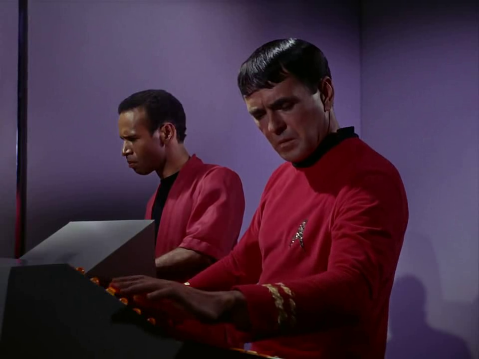
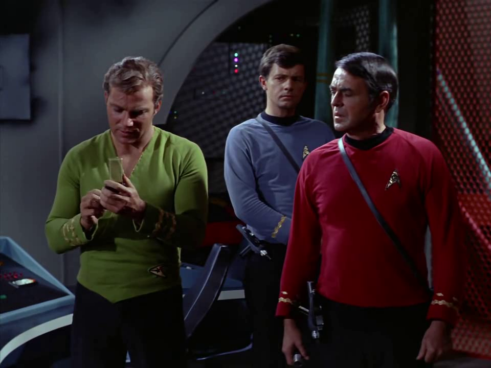
Your operations red:
Your command tan-ish, yellow-y:

And what I like to consider Kirk’s casual Friday greens, but I’m sure there’s some thoroughly-discussed other name for it:
A lot went into making Star Trek stand out visually. Star Trek became a cultural phenomenon in large part due to its sets and props and costumes. The production design is as iconic as the characters themselves.
Overall, Star Trek was one of the first series to take full advantage of colour television. The best way to show this is to just leave you with a few more screenshots which show the varied combinations of colour and lighting that create the singular style that made the Original Series truly original.