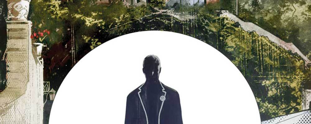
The Prisoner #1
Writer: Peter Milligan
Artist: Collin Lorimer
Publisher: Titan
Review by Sean Frankling

The Prisoner is such an inherently ‘sixties concept; it’s hard to imagine making sense of it in any other era. That’s exactly what Titan comics tried to do with The Prisoner #1, though. Albeit with somewhat uneven results.
First, a brief recap for the majority of readers who I suspect have never heard of The Prisoner before. The now-obscure British TV series tells the story of an unnamed intelligence agent held in a secret island prison known only as the Village. There, his captors used a sweetly manipulative population of neighbours, bizarre Mod design sensibilities, and good-old-fashioned gas lighting in an attempt to shake up the agent’s grasp on reality and extract privileged intelligence. While the show was short-lived, it’s also something of a cult classic for its unforgettable visuals and disconcerting mind games.
On the other hand, the first issue of Titan’s The Prisoner has none of that. Instead, the creative team has elected to add a detailed backstory of how the titular Prisoner came to find himself on the island. It may seem like a bad idea to spend the whole first issue of the series on exposition setting up a property whose primary draw was confusion and mystery in the first place. And yeah. It is.
The story The Prisoner #1 does tell is pretty standard espionage fair. It follows a 21st century reboot of the Prisoner himself as he lies, cheats, and steals in order to earn himself a one-way ticket to the island. This is interspersed with flashbacks to his one-dimensional love interest, explaining her capture as the reason he’s headed to the Village himself. Altogether, the whole issue is just here to set up what comes next. And it could have been much shorter to get us to the fun part faster. In fact, the original series opens with no exposition at all. Instead, it teases the viewer along by slowly hinting at a backstory that’s never fully clear. By contrast, this comic’s info dump of a prologue feels clunky and unsubtle.
Like the story in The Prisoner #1, this issue’s visuals are sound but bland. Good sequencing carries the action along well, and the artist shows real skill in environmental and character work. Unfortunately, there’s not much of interest here to put those skills to work other than offices and hallways. Based on the source material, it’s fair to expect that there are more exciting visuals to come, but they’re not here yet.
The Verdict: Wait and See.
This chapter of the story seems wholly unnecessary to me. The original show left its viewers tantalized with mysteries that never came to fruition. Who was the secret agent? How did he end up in the Village? And what sinister purpose laid behind his captor’s attempts to undermine his free will? In a lot of ways The Prisoner #1 has worked to ruin the sense of mystery that’s supposed to underly the Prisoner by dumping the answers to too many of these questions up front. But who knows? Maybe this creative team has even bigger revelations to come.


