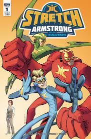
Stretch Armstrong and the Flex Fighters #1
Writers: Kevin Burke & Chris Wyatt
Artist: Nikos Koutsis
Colorist: Mike Toris
Letterer: Christa Miesner
Publisher: IDW Publishing
Review by Greg Brothers
In the last few years IDW has slowly been getting rights to more and more licensed properties. It has varied from  Disney characters, to 80’s cartoons, to 90’s sci-fi shows. With some of the properties they have even tried to create a share universe. The latest in their line-up comes from the 1960s elastic-skinned toy, Stretch Armstrong.
The first thing to note is that, despite there being a toy from the 1960’s, the book is actually based on a new Netflix show that started this past fall. Stretch Armstrong and the Flex Fighters #1 follows Jake Armstrong and his teammates Nathan Park and Ricardo Perez. The three of them have been exposed to a chemical called Flexarium, which has allowed their bodies to have the ability to stretch to otherworldy extremes. The team is introduced during a fight with an enhanced praying mantis.
The idea behind Stretch Armstrong and the Flex Fighters #1 is a solid one. Unfortunately, the execution is severely lacking. The dialogue between the characters is predictable and just screams of cookie cutter and safe discussions. You have one character who is the muscle of the team, complete with several catch phrases that even his teammates are tired of hearing. An overbearing parent plagues one of the other heroes. That same hero has even been saddled with the classic loss of one of his parents to add to the despair. The small attempts at humor come off as more juvenile than innovative. The plot of Stretch Armstrong and the Flex Fighters #1 hits many of the same snags that the characters do. It is predictable and bland. With the paint by numbers plot in place, many of the twists could be seen from panels if not pages away.
The art throughout is hit and miss. There are panels where the three main characters are crisp and clean, with sharp lines throughout. Then on other panels the monster that the team is fighting is muddled with little definition or details. It makes it hard to focus as you do not know what the next panel will hold. The colors throughout the panels are one of the few bright points throughout Stretch Armstrong and the Flex Fighters #1. The colors of the uniforms pop off the page, while buildings throughout are marked with gold, silvers and greys, giving them a more futuristic feel. The panel layouts at times make the page feel cluttered and cause the reader to become distracted. This makes it hard to follow the flow of the story as it all comes crashing together.
Verdict:
Skip it. Unless you are picking this book up for a child who somehow has become a fan of the TV show, there is no reason to pick up Stretch Armstrong and the Flex Fighters #1. The plot, dialogue, art and design all come to form a perfect union of mediocrity. Go ahead and skip this book, and spend your money on something that is a bit more inspired.


![[REVIEW] ‘MAJOR X #0’ TAKES IT BACK TO THE LATE ’80S (LITERALLY)](https://geekd-out.com/wp-content/uploads/2019/08/MajorX0Cover-150x150.jpeg)
