
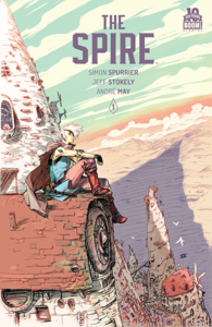
The Spire
Writer: Simon Spurrier
Artist: Jeff Stokely
Colorsist: André May
Letterer: Steve Wands
Publisher: BOOM! Studios
Review by Foosa Pendragon
The Spire is one of the most inspired comics I’ve read this year. It revolves around a post-apocalyptic universe with human and post-human beings living together. However, the story is a murder mystery with a post-human being, a Skew, Captain Shà as the protagonist. She is the official representative of the watch who doesn’t shy away from her sexuality and her dismay of the system that she exists within. Hence, the story highlights issues of internal, external and everyday racism and classism, while raising issues of corruption in government and the power of having connections. This is balanced with wit and humour. It includes positive ideas like inclusion of the post-humans by many and the pro-LGBTQA+ sentiments.
In the words of Spurrier, The Spire is “Blade Runner meets Dark Crystal, by way of Mad Max”.
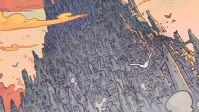
The juxtaposition of contrary ideas and ideologies are present in different elements of The Spire. The art by Jeff Stokely is both grotesque and beautiful, detailed and simple, colourful and colourless, and standing and moving. The experience of reading such a comic creates a similar world as our own with an element of othering that would familiarize the narrative to the reader, even with its fantastical elements. The panelling immerses the reader into the world and lets them move within the space. Please look at pages 68-71 and you’ll understand exactly what I mean. This is especially true with the tier system in place. The tiers are presented similarly to each other with increasingly distinct elements to differentiate each one.
The stylistic elements of the art can be reflected in the colouring by André May and in the lettering by Steve Wands. The colours are used to show both the squalor of the poorer tiers as well as the ostentatiousness of the richer ones. The lettering on the other hand presents different people’s speech based on typography and darkness. They present different accents and different volumes and types of speeches. These designs gave the comic new dimensions, increasing the readers’ interaction with the narrative.
The Verdict
Buy it! As an Eisner nominated story, The Spire does not disappoint with its poignant storytelling and the its combination of topical subjects. The heart of the narrative shows us how the world works both in the positive and negative light, especially when talking about inclusion and bigotry. The art that accompanies it also reflects that by a juxtaposition of contrary ideas like detailed and simple panels. The colours are used in the same way by making certain areas colourful and bright and other colourless and dark. The lettering also adds a new element to the comic genre by providing different typography and different lightness and darkness. The comic is very innovative in so many ways and the story weaves all those elements together beautifully.


![[PODCAST] TONIGHT WE ENTER THE FANDOME!](https://geekd-out.com/wp-content/uploads/2017/11/comics-agenda-2-150x150.jpg)