
Writer: Matt Fraction 
Artist: Steve Lieber
Colorist: Nathan Fairbairn
Letterer: Clayton Cowles
Cover Artists: Steve Lieber, Nathan Fairbairn
Publisher: DC Comics
Much like Lois Lane, Jimmy Olsen is one of the oldest characters in the DC Universe, but he rarely gets to take the spotlight away from Superman. That changes with this week’s revival of the classic Superman’s Pal Jimmy Olsen title, and it comes courtesy of some top-notch talent from the comics scene.
Jimmy Olsen is the second of two titles (along with Lois Lane) spinning off from the current Event Leviathan crossover series, itself technically an offshoot of Brian Michael Bendis’ dual Superman/Action Comics run. What this one has in common with those is that, while knowledge of recent continuity would be beneficial, you can really dig into Jimmy Olsen without much preamble. If you’re looking for a breezy reading experience about one of the most familiar superhero sidekicks, then Superman’s Pal Jimmy Olsen is for you.
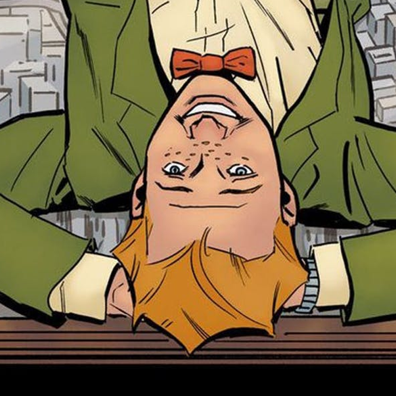
The original Superman’s Pal Jimmy Olsen series was chock full of Silver Age whimsy that often involved Jimmy getting himself transformed into a number of things (e.g. a gorilla, various types of superheroes, cross-dressing as women) usually requiring Superman’s help to revert him back to normal. (Fun fact: Darkseid’s first ever appearance was technically in Jimmy Olsen #134, of all things!) Based on this first issue, it seems writer Matt Fraction has no intention of getting rid of the character’s humorous tone, and that’s a good thing.
One thing you can’t deny about Jimmy Olsen is the creative firepower it contains. As well as the aforementioned Fraction, whose beloved Hawkeye ended four years ago this week, he brings along fellow Marvel alum Steve Lieber, whose acclaimed Super Foes of Spider-Man ran concurrently with the former. Together, they’re unstoppable — it’s such a perfect match of sensibilities that you have to wonder why it never happened sooner. Fraction’s script is witty enough on its own, but Lieber’s art takes it over the top. It also helps that Lieber’s style is very compatible with the platonic ideal of Silver Age comics, with clean lines and simple layouts. Colorist Nathan Fairbairn’s palette is equally suited to the aesthetic, opting for flat tones whenever possible but utilizing visual depth when appropriate. It’s easy to pretend this is a comic that was published decades ago, and I say that in a good way.
Superman's Pal, Jimmy Olsen #1
Credits
- Fraction's witty script
- Lieber's art is a perfect match for the desired tone
Credits (cont)
- May benefit from some added context of recent continuity


![[REVIEW] JUSTICE LEAGUE DARK ANNUAL #1](https://geekd-out.com/wp-content/uploads/2019/07/justice-league-dark-annual-1-featured-150x150.png)