
 Heavy #1 is a high-powered, fever dream of cosmic violence where time has no meaning. Equal parts Preacher and The Punisher, Heavy wears its influences on its sleeves … then proceeds to shred them to pieces. Written by Max Bemis with art by Eryk Donovan and colors by Chris Peter, Heavy revolves around Bill, a bounty hunter of sorts.
As a Heavy, Bill is tasked with traversing the multiverse and slaying the worst of the worst. The kicker? He’s already dead. Occupying a space called “The Big Wait,” Bill takes on contracts to rack up enough credit so that he may one day reunite with his dearly departed wife. And what’s the one way to speed up the process? Get a partner and double the body count. Unfortunately for Bill, he may have been better off sticking as the brooding hero who works alone.
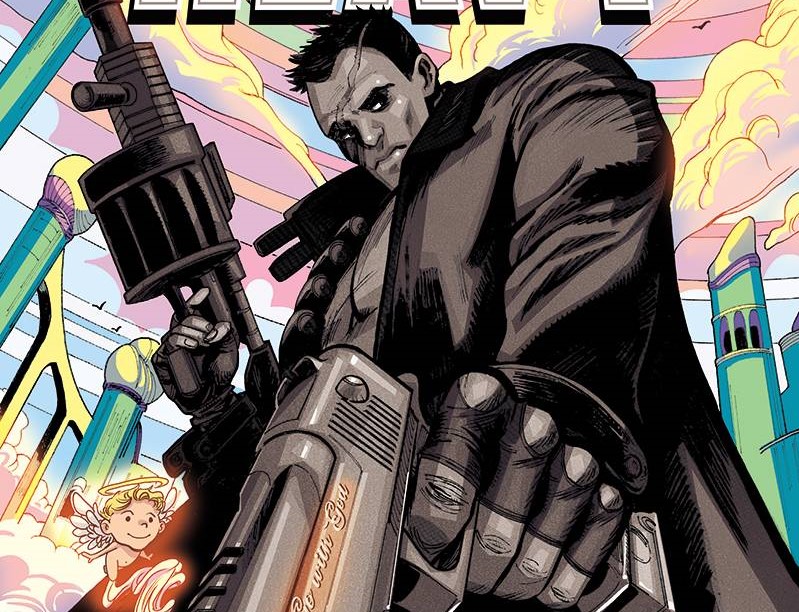
Comicbook cover art can sometimes be misleading. However, in the case of Heavy #1, the depiction of a trench coat-wearing, dual-wielding, scar-faced action hero juxtaposed with a cotton candy background tells you all you need to know about Heavy. Our hero isn’t the same tough guy action star you’ve seen countless times. Instead, Bill’s dialogue is injected with a self-aware sense of deadpan humor that clashes well with the absurdness surrounding him. This not only sets the story apart from others, but it also humanizes Bill. Coupled with this is the wackiness that comes with a multiverse where anything is possible and nothing is left off the table. The end result is a well-paced and humorous first issue that tells the reader exactly what they need to know for the rest of this journey.
Though Heavy is a subversion of Punisher-type characters, that doesn’t mean the violence is any less spectacular. Making good use of splash pages and dynamic yet digestible layouts, Donovan’s art fully captures a high octane sense of movement and action. This keeps the issue from becoming stale, and it’s clear that Donovan had fun drawing these scenes. Alongside this is Peter’s candy-esque color palette. Nearly every page is filled with a splash of light pinks and purples that adds to the psychedelic absurdness of Bill’s predicament. It’s a bit overbearing at times, but it’s thankfully broken up by some more varied pages. Taylor Esposito’s letters are fine and move well within the layouts but aren’t given much else to do. More use of sound effects could’ve given The Big Wait more character, like whenever a portal is ripped open.
As a first issue, Heavy does a good job at setting up the world and leaving you wanting more. The script and artwork provide great humor and pathos from its main protagonist, while the candy-coated color palette helps breathe life into its pages. From interviews with Bemis, it’s clear that Heavy is a deeply personal tale. It’s the product of years of his own experiences wrapped up in a story of “dumb boys with big guns.” Even if readers don’t connect with his themes right away, they will no doubt still have a good time with Heavy. With this first issue, Heavy promises to be a cosmically violent epic with a heart of gold.
Heavy #1
Credits
- Writer: Max Bemis
- Artist: Eryk Donovan
- Colorist: Chris Peter
- Letterer: Taylor Esposito
- Cover Artists: Eryk Donovan, Chris Peter
Credits (cont)
- Editor: Adrian F. Wassel
- Publisher: Vault Comics

![[REVIEW] ‘ALWAYS BE MY MAYBE’ IS A FRESH VOICE IN ROMCOMS](https://geekd-out.com/wp-content/uploads/2019/06/Always-be-my-Maybe-poster-150x150.jpg)
![[REVIEW] FRESH](https://geekd-out.com/wp-content/uploads/2022/03/fresh-movie-review-2022-150x150.jpg)