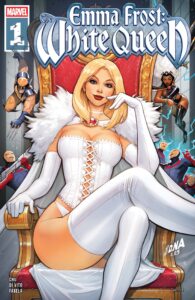
 Marvel’s preeminent horse-killing headmistress takes us back in time in Emma Frost: The White Queen #1, and there’s a traitor in her midst!
Set sometime after X-Men #138 (right after the Dark Phoenix Saga ended, when Cyclops leaves the team), Emma Frost: The White Queen presents an unseen chapter in Emma’s villain era. (Someone has infiltrated the Hellfire Club?! Quelle surprise…) These sorts of flashback stories can be a fun way to revisit the past and remind readers how far some characters have progressed in their time, and if any character has changed over the years, Emma is certainly one of them.
One problem I have with this issue though —and presumably the series at large— is that some of the creative choices are at odds with the setting of the story in a way that feels jarring. As mentioned, this arc is set after X-Men #138 (right after the Dark Phoenix Saga ended, when Cyclops leaves the team) which would place it around ~1980. Some of the dialogue and character designs, however, don’t really convey that. Ex. Noor, Emma’s personal assistant, who I can only describe visually as “2020s they/them.” I’m not against a non-binary character appearing in an X-Men comic, obviously, but I was confused by their presence in what I’d known to be a flashback story. (And that’s setting aside the unintended question of what exactly happened to this person and why did Emma never acknowledge them ever again…)
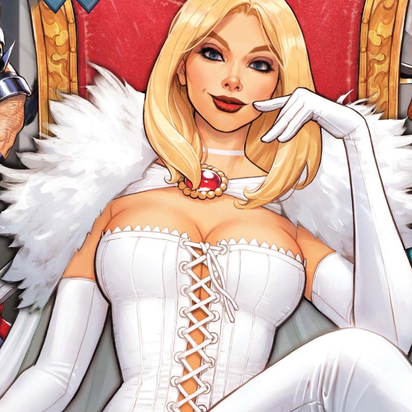
I’m all for revisionism and inserting diversity into the established past of these universes, but that’s difficult to do successfully when we’re paying homage to very specific eras. Even accounting for the sliding timescale and wanting to keep these stories (paradoxically) fresh, flashbacks like Emma Frost: The White Queen tend to mimic the aesthetics of the past fairly faithfully. When they diverge, it feels weird? Especially since thus far, I don’t know why this series needs to be set in the past. (A more nitpicky note: Emma is depicted with blue lips here, which was not a fashion choice of hers until the 2000s. But the cover does reflect that!)
In any event, writer Amy Chu has a good handle on the character —even if she doesn’t come across as menacing as she probably should, see the above critique— and I am curious to see where this story goes. And whatever quibbles I have for the way these characters are presented, the art itself is not an issue; Andrea di Vito’s style is so clean yet detailed, which color artist Antonio Fabela accentuates. For fans of the character, Emma Frost: The White Queen is definitely worth seeking out.


