Oasis Review
Written by: Alex Wills
Art by: Breno Girafa
Letters by: Eduardo Camacho
A review by Cory Webber
 “Oasis is about four orphans, fighting for survival in future Los Angeles, who find a home and a mission when they are taken in by Miranda, a mysterious hacker who is determined to destroy the city’s hyper-stratified social order at any cost. Heartwarming family dynamics clash with brutal violence in this meditation on the line between revolution and terrorism.”
Now, that above is the description provided by the creator of Oasis. Without having read this prior to diving into this 9-issue collection, I would have not known what the heck was going on. After finishing, I had to re-read the first issue, which takes place near the end of the story, just to understand what was going.
Issues 2-5 provide backgrounds for the four orphans (Trace, Lord, Ruff and Brite). Each chapter provides great back story and instills sympathy for each character and the situation they are in that leads to Miranda taking them in. Issues 6-9 follow the group as they fight back against the existing discriminatory social order.
The problem I had with the story is that it’s not entirely clear who they are fighting, other than the vague persona of the upper class. I don’t know if it was because it was in black and white, but I had a tough time following certain sequences, especially certain action sequences. (Full disclosure: this was the first black and white comic I had ever read). Once I finished the book, and re-read the first issue, I still was confused about some major plot points involving some characters’ deaths and subsequent resurrections (?) weren’t explained. I still am not sure what I just read.
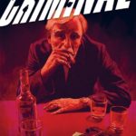
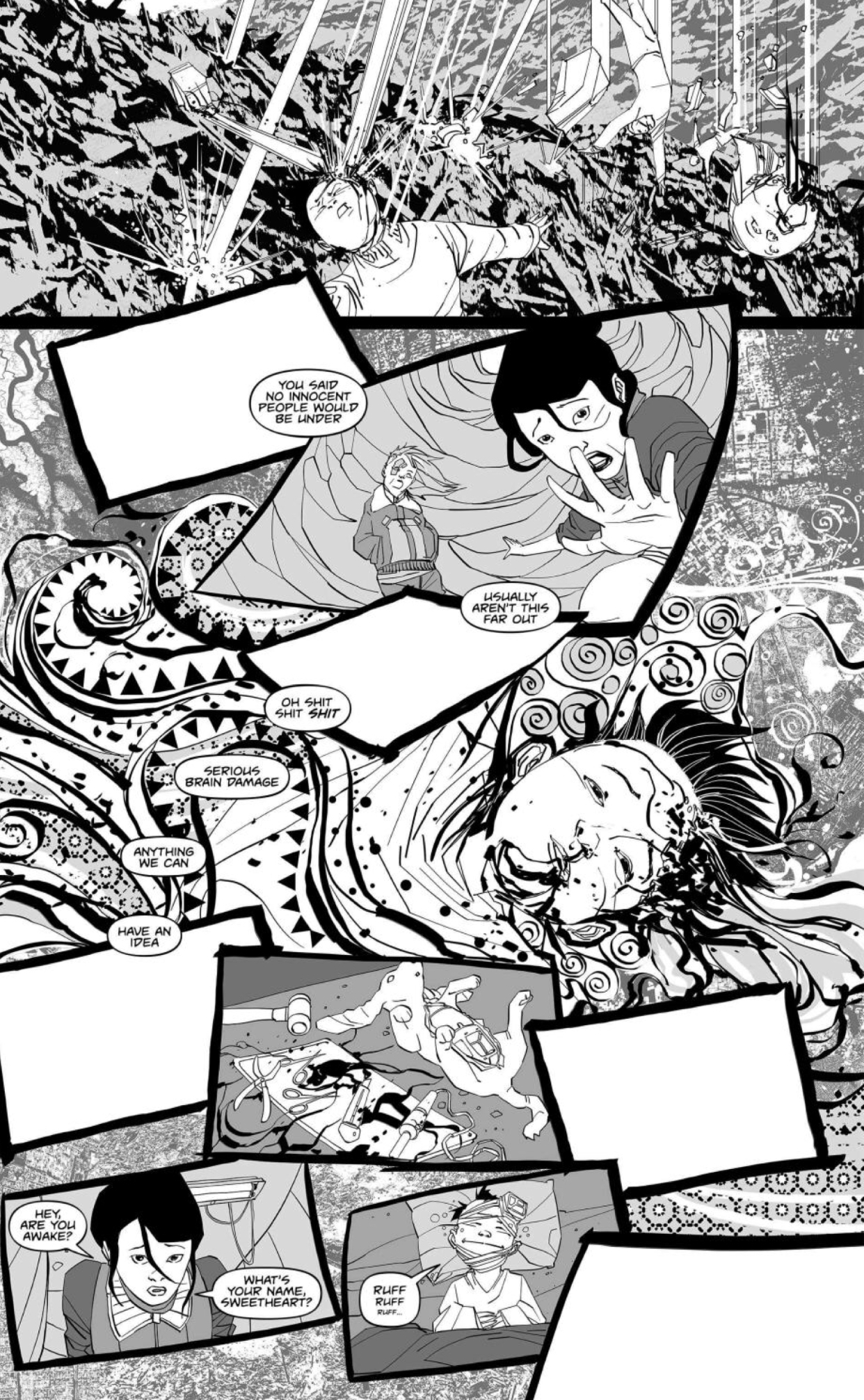
Next, let’s talk about the art by Breno Girafa was good in some spots. Some pages, like the featured image above, felt like they came out of a Jack Kirby book. However, I really feel like the choice to not color this book really hurt the art. When I saw the covers (see: image above of Issue 1’s cover), I was expecting some bright, loud colors attacking my senses. I’m not saying that black and white is always a bad choice– I did end up getting used to it, but I feel like there could have been more contrast, and deeper blacks. The facial expressions and character designs were good. I was able to distinguish one character from another. One of the brighter spots of this book was the lettering. They say that if you don’t notice the lettering, then the letterer did their job. And Eduardo Camacho did his job. The font, spacing and size were spot on.
Verdict:
I hate to say not to buy it, even though some aspects of the art were brilliant, but the book just did not resonate with me. The lack of color, muddled storyline and ill-defined characterization of the group’s opposition left me unenthusiastic, to say the least. As far as post-apocalyptic, “fighting-against-the-man” type stories, you could do better.