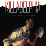
Writer: Rodney Barnes
Artist: Jason Shawn Alexander
Colorist: Luis NCT
Letterer: Marshall Dillon
Cover Artists: Jason Shawn Alexander, Luis NCT
Publisher: Image Comics
Every now and then, a first issue comes along that blends story, pacing, concept, art, color, tone, and dialogue together so well, you just know you’ve found something special.
Killadephia #1 is one of those.
Let’s dispense the self-indulgent writing and just get down to facts. Killadelphia is good. It’s really good and it has room to grow. It’s gritty and dirty with a story that’s equal parts engaging and intriguing. It’s a dark tale with political overtones that drips with mystery.
Killadelphia follows James Sangster Jr. whose father, James Sangster Sr., was killed just ten days earlier. James Sr. was a homicide detective who was handed a missing persons case. This brought him into contact with someone (or something) that didn’t take too kindly to him sticking his nose around and had to do away with him. We find out who and we find out how, but that won’t be spoiled here! James Jr. (who’s a Baltimore police officer) comes to Philadelphia to bury his father and maybe get some more context into what exactly happened. The stinger on the final page is gasp-inducing and something that almost demands you hop on board for the next issue.
Written by Rodney Barnes with art by Jason Shawn Alexander, Killadelphia satisfies your thirst for urban horror. Barnes weaves an intricate plot that’s open-ended enough to entice you to come back but streamlined in a way that you never feel overwhelmed or lost. The title of the book plays in perfectly to the plot, and it’s very catchy.
From the first page, Barnes hooks you with a hard-hitting, realistic approach to a very familiar trope while also creating a mystery about what exactly is happening. Barnes chooses his words carefully in Killadelphia and wastes none of them. Every line is delivered with purpose and every interaction has significance. Barnes also employs a narrative structure that jumps between these two time periods while the overlying narration flows through Killadelphia. It works like a charm and imbues each scene with an emotional weight.
It does jump around a bit at times that may cause a bit of a readability issue, but it was so minor that it’s basically unnoticeable. It’s all tightly constructed to charge towards the final few pages of the issue. Barnes does an incredible job of making the more fantastical elements of the book relatable by painting them in the context of a son living in the shadow of his father. It’s purposeful and complex. That’s the real hook of this comic. The humanity of it.
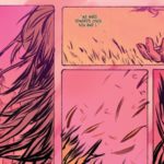
Killadelphia also benefits from absolutely astounding art. Alexander’s pages have a gravelly quality to them that compliment the story perfectly. He creates a terrifying immediacy that jumps out from each page. Luis NCT’s coloring matches the tone that Alexander sets and both work in unison to make a gorgeous book.
It’s a comic that knows what it’s trying to do and succeeds in doing it. This is a book that should be at the top of everyone’s read pile.
There’s evil in Philadelphia, and it’s kill or be killed.


![[REVIEW] SCARLET WITCH #1](https://geekd-out.com/wp-content/uploads/2023/01/sw-1-feat-150x150.jpeg)
![[RETROSPECTIVE] ‘SUICIDE SQUAD’ (1987) #9-#16](https://geekd-out.com/wp-content/uploads/2021/01/SS-retro-2-featured-image-150x150.jpg)