Stroper #1-3
Creator: Eddie Porter
Publisher: Self-Published
Review by Cory Webber
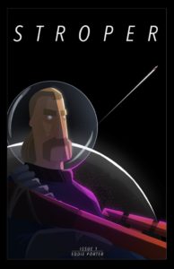
 Stroper is dubbed as a sci-fi, retro-noir blast. In a nutshell, it’s mullets, ass-kicking, neon lights and ray guns. The basic premise is that the Galactic Union, a corrupt, united political body, rules over the civilized systems. The Union’s bloated bureaucracy and deep corruption puts enormous weight on the spacefaring working class, making it nearly impossible to survive or thrive doing honest work. The illegal hunting and selling of alien wildlife, known as stroping, is in extremely high demand.
Stroper #1-3 follows Pak Booker, a Stroper imprisoned in the Bo’ak 5 prison mines, who seeks revenge on the people that locked him away. However, his story is not as straightforward as it appears, and his journey to redemption has only just begun.
The concept for Stroper is nuts, in the best possible way. However, the execution is a little shaky. While I do think the premise is promising, and the world building is decent, the story could have been told in one, maybe one-and-a-half issues. As is, there were too many pages that consisted of three panels. And that’s without mentionjng the various splash pages in each issue. So, condensing some sequences into fewer pages with more panels could have gone a long way in streamlining the plot and evening up the pacing.
As it stands, not much happens story-wise in the first three issues. We begin by seeing that Pak is in prison, but before we get to know him, we launch into the events that landed him behind bars. First, we see the illegal skulduggery that leads him to his current predicament. Then, there is some jumping around, time-wise, that was kind of confusing. I’m assuming these threads will come together in future issues. A strong point for me was the humorous, co-dependent relationship between Pak and Tango, his droid-like companion. There were actually a couple interactions that elicited a solid chuckle or two.
Now, the art in Stroper was actually quite good. The composition of most panels was striking with a great use of lights and shadows. Furthermore, the art was minimalistic and somewhat geometrical. And, I enjoyed the use of bright, neon colors and how they contrasted with the deep shadows and blackness of space. Some pages were composed with an almost Mondo-esque feel to them. However, there were some panels where the minimalistic art made it feel a little too bare.
Verdict: Wait and see.
While I did enjoy Stroper, for the most part, I felt that the page layouts spread the story too thin over these first three issues. Therefore, subsequent issues would greatly benefit from telling more story per page by adding more panels and reducing the number of splash pages per issue.
Stroper can be purchased at https://www.stropercomic.com.


