

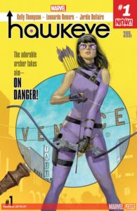
Hawkeye #1
Writer: Kelly Thompson
Artist: Leonardo Romero
Colorist: Jordie Bellaire
Publisher: Marvel
A review by Adrian Hodgkiss
 Hawkeye is the third Marvel number 1 I have reviewed in as many weeks. So far I have been struck by the diversity in the three titles and how all three exist within the same universe but manage to have their own voice and identity.
This is Kate Bishop’s first ever solo series and I, for one, think her Hawkeye has the potential to be something special. At times this feels like an independent comic, like Kelly Thompson created her and plonked her in Venice beach herself. The adventure centres around real civilian problems as Kate attempts to get her PI business “Hawk-eye investigations” off the ground. It is important to note that the “eye” is actually a crudely draw picture of a human eye. On count back, Kate only wears her costume in four pages of this book but it does not suffer as a result.
We meet Kate tailing a surfer at the beach where she gets distracted. After foiling a bank robbery, which includes a heavy dose of Point Break referencing, Kate returns to her office. The crude sign hasn’t really worked as fourteen of her walk-in customers were actually looking for “The Real Hawkeye”, twelve of them to punch him in the face, and seven more were looking for an optometrist. Eventually a young college student named Mikka enters, she is being harassed and stalked online by a sinister stranger. Kate agrees to take the case and quickly sets to work.
Matt Fraction’s recent work with Kate Bishop aside, Hawkeye #1 is the incarnation that feels like a genuine and three dimensional young women who just so happens to be extraordinary at firing arrows, solving crimes, and kicking butt. She accepts her faults and shortcomings and even displays vulnerability, but she serves that with a steady stream of sass or sarcasm. Kate’s personality is excellently conveyed by inner monologue which is full of humour. Did I mention that she is also an eminently quotable crime solving bad ass?
The art in Hawkeye #1, by Leonardo Romero, is perfectly matched with the overall feel of the book. It’s a really strong work throughout, with some really clever and dynamic pages that stand out wonderfully. There are some really clever design elements like the three dimensional drawing of Kate’s H.Q./apartment and the first interior page set out like an application form for a P.I. license. This page comes complete with funny hand-written post-it-notes and references to other characters. A really nice touch that works well and sets off the book perfectly.
I can’t complete this review without, yet again, a tip of the proverbial hat to Jordie Bellaire and her wonderful ability to color anything beautifully. Whether it’s the interior of a dingy P.I. office or a hot Venice beach exterior, Bellaire nails it.
The Verdict
Buy it! Buy Hawkeye #1 twice if you can, this is a funny and fun opening to a character I really enjoy spending time with. She may not have bombastic world saving adventures in Venice beach but she makes up for that in other ways. I really enjoy the art style and the characterization, it feels like Kelly Thompson knows her character and is comfortable with letting Kate be herself. I find that if I am going to read an on-going I have to want to spend time with the character and in this instance I do. Kate’s new solo career has some great potential.