Writer: David M. Booher
Artist: Drew Zucker
Colorist: Vittorio Astone
Letterer: Deron Bennet
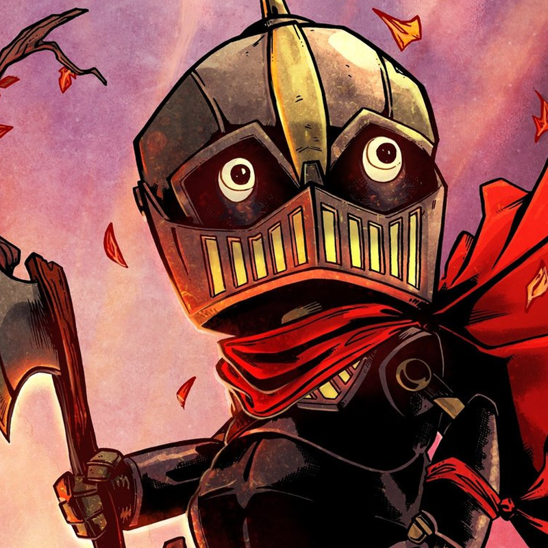
Cover Artist: Drew Zucker & Vittorio Astone
Editor: David Mariotte
Publisher: IDW Publishing
 Set in a fantastical world where tiny tin people (think Wizard of Oz) with clocks for hearts are enslaved by satyr-like overlords, our titular protagonist Canto yearns to be free. Although he and his ilk are forbidden to have names and relationships, Canto has both. Canto’s beloved is damaged beyond repair because of him. He is sent on a dangerous quest to retrieve her heart from their slavers before she meets a fiery death in a furnace.
IDW has described Canto as an all-ages title, and I think it’s an apt statement. While carrying heavy themes of slavery, mutilation, and sacrifice (to name a few), it never feels like it would be inappropriate for a young child to read. For example, violence is implied, but never outright shown on-page. The term “all-ages” tends to function a euphemism for “kiddie” in comics, but Canto is a great example of something that truly does feel like it could be for anybody regardless of how old they are.
Canto definitely has a flair mirroring that of The Dark Crystal as well as the aforementioned Wizard of Oz (which is directly quoted on the credits page) that I found very appealing. A lot of this is down to Drew Zucker’s art, which successfully makes you empathize with Canto. Despite him not having much in the way of a face, his eyes are expressive enough that you get all you need from them. The look of the book itself is generally fantastic, with heavy inks and stylized proportions complemented by Vittorio Astone’s rich colors. You could easily imagine the art direction here easily translate itself to a stop-motion animated film or even one with puppetry, not unlike The Dark Crystal. Letterer Deron Bennet rounds out the visual team with quality lettering that doesn’t call attention to itself except when purposeful, i.e., sound effects and the like.
David M. Booher’s script is also very tight and strong, sufficiently laying out the premise of the overall series based on this first issue. The mark of a good comic book writer is knowing when to say nothing and let the pages speak for themselves, which happens quite often here. By my count, there’s a handful of pages without any text on them, save for the occasional sound effects. I appreciate any comic that knows when to pull back on narration or dialogue for the sake of them, letting the art breathe and do it’s own job of visual storytelling, so Canto gets high marks in that regard.


![[PODCAST] Fanboy Power Hour Episode 248: THE HORROR (CON)](https://geekd-out.com/wp-content/uploads/2019/06/FanboyBanner-2-150x150.png)

