Big Moose (One Shot)
Archie Comics
Writer(s): Sean Ryan, Ryan Cady, Gorf
Artist(s): Cory Smith, Thomas Pitilli, Ryan Jampole
Colorist(s): Matt Hers, Glenn Whitmore, Kelly Fitzpatrick
Letters: Jim Campbell
Review by Insha Fitzpatrick
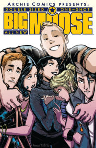
 This double-sized one shot showcases a character that has been behind the scenes for many years, but brings him to the front to show you just what he’s made of.
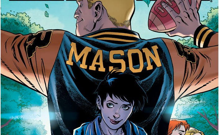
Moose has always been a loveable character in the Archie Comics universe. The muscle football player with the heart of gold has been seen as a “dumb” character to most. Within Big Moose, it displays three side of Marmaduke Mason, or Moose Mason, that we’ve already seen or we haven’t seen before. So, I think the best thing to do is take these in review story by story because they all have their own special Moose-ness about them.
Moose Vs. The Vending Machine, written by Sean Ryan, art by Cory Smith and colors by Matt Herms, is a characterization of Moose that we’re used to seeing. Moose Vs. The Vending Machine is Moose’s quest to get food out of a vending machine after a boring lesson makes him hungry to the max. This story is a genius start of putting Moose in the spotlight. We’re not only introduced to the kind gentle giant that Moose is. This story SCREAMS classic Moose. This is the Moose I love and would love to see more of. Sean really captures the characters of this in a pretty dope way, even highlighting the gentle and loving relationship he has with Midge and the trickster type relationship he has with Jughead.
Cory’s art fits so well with Moose, he takes the character design of Gentle Giant and runs with it. Matt Herms colors are so realistic and warm, but he also gives it a b-movie type detail, especially in scene where Cory draws him thinking about what he wants to do and posing. As a whole, this one-shot really stood out to me because it’s legit like the classic Archie Comics. Heard that Archie Comics, give Sean Ryan, Cory Smith and Matt Herms more Moose power.
Have It All, written by Ryan Cady, art by Thomas Pitilli and colors by Glenn Whitmore, tells the story of Moose having a jam packed week that could result in him being a little overwhelmed. Moose is excited about his week, but when things start to feel a little bit heavy on him, he finds out what he can do to help others and to help himself.
Have It All is one of those stories that really get deep into the character. We see Moose as the all-american boy or the “gotdanged American dream” as his coach said. However, there’s something super cool and deeper going on within these panel that’s kinda brings Moose in and out of being the perfect specimen of a person. The week of Moose’s jam packed life really details who he is as a person. He’s a great son, a gifted athlete, an awesome friend, a bully handler, a great boyfriend to Midge and a bit teddy bear. People think that he’s dumb, but he knows that he’s so much more and that’s what makes him special. Ryan Cady writes such a good story with hidden details about who he is. For example, Moose is a people pleaser and it’s shown here throughout the interactions he has. One good example about a hidden details is Moose’s dyslexia. While, I don’t know if it was ever confirmed, but Moose has a learning disability, that SMALL moment in the story when he’s trying to read the words and they all run together really shows you something about Moose you’ve never seen. While the first story was a throwback to classic Moose, Have It All felt like it could be the start of something bigger, or even the start of an ongoing.
Thomas Pitilli art is outstanding in this, I love the way he creates, especially the little details that he brings out with simplicity in his inking. It’s honestly superb, but that wouldn’t be anything without colors by Glenn Whitmore. These two working together in Have It All really bring out the “all-american”-ness to this comic and it does it so well. The only criticism I have about the entire thing is Jughead’s outfit. Just… nah. Please don’t. Other than that, I love the feel of this comic, you swing from panel to panel with a sense of vibrancy. A couple of panels I loved are from Thursday, where Midge and Moose actually go on their date. The colors and art in that anniversary panel alone are so gorgeous.
The Big Difference, written by Gorf, art by Ryan Jampole and colors by Kelly Fitzpatrick, focus on Moose and Colin, a freshmen who looks up to Moose in every way and wishes to be athletic like him. When Jughead points out that Moose should take it easy on Colin because he’s different than the rest of them. Moose doesn’t understand. He doesn’t see a difference about Colin when everyone else tends to focus on it and so he tries to cater to what everyone else knows.
I had to take another read of this one when I first read it, not because it was bad, it was quite the opposite. It felt like it wanted to say something that I didn’t get at first, but then I understood. Moose, again, is a lovable gentle giant, so when you put Moose in the same room who might have a difference than him, he doesn’t see it. In fact, he actually really doesn’t see it. Gorf writes Moose in a way that he treat everyone equal until they try to flirt with Midge and then you’ve got a problem. I liked this because when Colin caught on that Moose was treating him differently he called him out. The differences between them are SO laid out to us clear as day, but Moose just puts him in the same category as everyone else and that’s what makes Moose… Moose.
Ryan Jampole and Kelly Fitzpatrick work in harmony to carry out the look of this comic and its way too cute not to mention. I love Ryan’s cartoon/illustrative work and within The Big Difference, it’s something I didn’t expect to see, but I’m so happy that it’s apart of this one shot. It creates an entirely different tone from the other two. It’s comedic, but serious, but fits so well within the story of these two kids that it just makes it all the better. Another amazing thing that compliments Ryan’s art is Kelly’s colors. Kelly is one of my favorite colorist and she dominates here just as she does with any comic she’s attached to. She makes colors vibrant and fun and she compliments anyone art style so very well it leaves you in awe.
Verdict:
BUY IT! Big Moose is such a lovely introduction to everyones favorite gentle guy. I’d love to see more of Moose and Midge floating around in all my comics, but this one shot of Moose definitely shows you three different sides of this guy to gain some more knowledge abut him and to love him just as much as all Archie fans do. I hope to see more of Have It All in a ongoing series, but depending on Archie Comics, we still have this Moose one shot to swoon over.
[Sidenote: Still waiting for Archie Comics to call me about that Midge One-Shot. I’m waiting. ;])

![[PODCAST] THE COMICS AGENDA: IT’S A HALLOWEEN WEEKEND](https://geekd-out.com/wp-content/uploads/2017/11/comics-agenda-2-150x150.jpg)

