
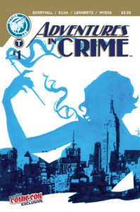
Adventures in Crime #1
Writer: Shane Berryhill
Artists: Hoyt Silva
Colorists: Kevin Lennertz
Letterer: Micah Myers
Editor: Nicole Dandria
Publisher: Action Lab
A review by Robert Coffil
 Gangs, guns, booze, and comics? The first three are uttered in conjunction often, the latter not so much. Adventures in Crime tells a gritty noir story set on the cusp of the Great Depression and World War Two about a comic creator, Jack Levi, trying to share his comic with the world.
Jack Levi in 1939 was just looking to break into comics. He waits for his big meeting with the Editor and Chief of Apogee Comics, Major Henry Wheeler, and he waits all day. Eventually, Jack gets tired of waiting and tries to make his way past the goon at the door. That doesn’t go so well and he is summarily told grab his stuff and leave, while picking his pride and portfolio up off the floor. Some of the staff in Apogee see his work on the floor and are surprised by the quality they see in the work while they narrowly avoid stepping on it when they are walking out the door. They know how Wheeler works and he will never go 50/50 as our protagonist Levi wants and offer to present it as their work. Not one to be dismayed, he, at the behest of a beautiful lady in the office, does something both brave and stupid to get into Wheeler’s office at the top of the skyscraper. When in Wheeler’s office the deal isn’t as lucrative or creatively empowering as young Jack would hope and thus concludes their business interaction. When he leaves the building he runs into an old friend from his early days and they proceed to paint the town red in Harlem. What follows is easily the best part of the book, but I don’t want to give out to many spoilers. Suffice it to say that it only gets better and pulpier.
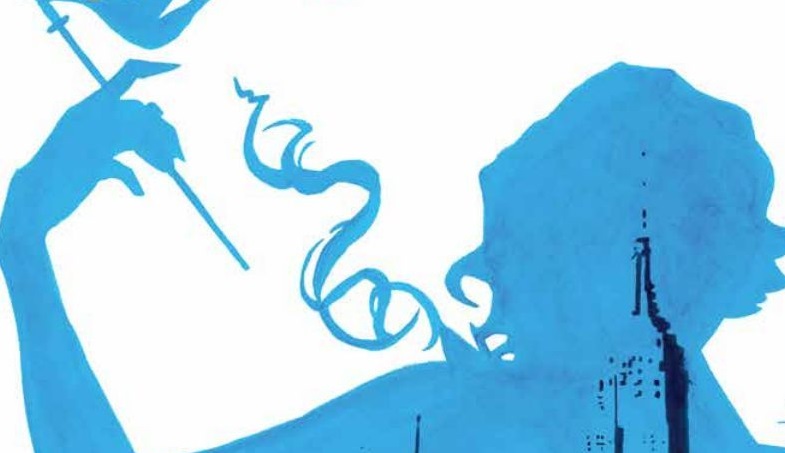
The art by Hoyt Silva really drives the plot of Shane Berryman. There is this wonderful establishing shot on the third page of the comic. The Skyscraper of Apogee is on the left and the progression of Jack’s day is on the right hand panels. It works perfectly because as he begins his day with the loftiest of goals he’s at the top of the right hand panel stack. As he becomes more and more dejected throughout the day he ends up right next to the ground floor of the skyscraper. It’s the perfect use of the art form to convey mood through storytelling.
I do want to talk about the colors of Kevin Lennertz. The colors work well to establish the mood in the book. When Levi is in the office building you see this brown hue to symbolize this office building’s workman like nature. When Jack is in Wheeler’s office there is a very powerful green in the background to symbolize Wheeler’s money hungry nature. And when Jack runs into his friend and they go partying there is this seedy purple that seeps into the panels. It’s done very well.
Another thing I enjoyed about this book was how history adjacent it was. Young Jewish kids who have skills that should land them higher earning jobs in more illustrious careers did often find themselves working in the ‘ghettos’ of comics. The idea that an editor and chief at a big comic book company would take the rights to a character that an artist drew and barely pay him a livable wage is very similar to the story of too many comic creators of those early days.
The Verdict
Buy it! I’ve never read a pulpier story that would serve to offer as social commentary on the early days of comics before. I liked this book. The characters felt full of life and it offered an interesting enough hook to have me come back for the next issue. When this comes out in 2017, buy it!


![[REVIEW] HELLFIRE GALA: WEEK ONE](https://geekd-out.com/wp-content/uploads/2021/06/hellfire-gala-1-feat-150x150.jpeg)