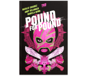
Writer: Natalie Chaidez
Artist: Andy Belanger
Color Artist: Daniela Miwa
Letterer: Serge Lapointe
Publisher: TKO Studios
TKO’s second wave of books has been out for a couple months now, but that doesn’t mean the books aren’t relevant anymore. In fact, I would love for as many people as possible to read Pound for Pound.
Pound for Pound is about a female boxer named Dani and her younger sister Espie, who gets kidnapped by a dangerous man. In order to get her back, Dani has to face her traumatic past — the same past she gets lost in during black-outs. And, as she ventures deeper into the desert in hopes of saving Espie, things only get stranger..
I gotta be honest here, I didn’t know what to expect of this comic. But whatever it was, I definitely didn’t expect that. I went in with few expectations and found myself blown away by every single aspect of the story: the narrative, the art, the panel layouts. Pound for Pound was definitely one of TKO’s stronger publications, in my opinion.
It’s a solid story from the beginning to the end. There were no moments of confusion or moments where I felt like I missed something. The amount of swearing in the dialogue amused me, though sometimes it felt a bit overdone. It did set the tone nicely for the characters, though. All the main characters, especially Dani, are very strong people whom you would not want to cross. After the first chapter, I already felt like I knew exactly who Dani was and what she stood for. The story kept me on the edge of my seat, and I caught myself saying “oh f*ck” a couple times as well. Especially the twist towards the end … But no spoilers. You’ll have to read it for yourself.
The art really impressed me during the fight scenes (of which there are a lot). I found myself inspecting every inch of the page, just imagining the amount of work it must have taken to compose it. Additionally, the panel layouts were very creative. Not that I saw many things I hadn’t seen before, but the combination of the panel shapes and sizes, along with the story and art, blended together perfectly. I’ve seen comics before that tried to be creative with the panel layout but ended up only confusing the reader. This comic did not have that issue at all.
I was also really enthusiastic about was the coloring. Seriously, I love love love the coloring on this one. The color palettes were really complimentary and aesthetically pleasing. Usually coloring doesn’t really leave an impression on me, so that says a lot!
Go buy Pound for Pound! Seriously, go read it. You won’t be disappointed.


![[REVIEW] ‘ALLEN V. FARROW’: A DOCUSERIES FOR THE AGE OF #METOO](https://geekd-out.com/wp-content/uploads/2021/04/210315-think-allen-v-farrow-hbo-doc-se-1130a_8e70de7479a0ce6ca2295a4741e5d707.nbcnews-fp-1200-630-150x150.jpg)
![[REVIEW] ONE WORLD UNDER DOOM #1](https://geekd-out.com/wp-content/uploads/2025/02/owud1-feat-150x150.jpg)
![[REVIEW] THE DEATH OF DOCTOR STRANGE: AVENGERS #1](https://geekd-out.com/wp-content/uploads/2021/11/dr-avengers-1-feat-150x150.jpeg)